When most people think about improving content performance, their minds go straight to better headlines, more compelling calls to action, or tighter messaging. While these are undeniably important, many marketers overlook one of the most powerful tools available to them: UX (User Experience) design.
Borrowing layout and structure techniques from UX designers can dramatically improve how users engage with your content. Whether you're creating blog posts, landing pages, or newsletters, your layout plays a crucial role in how your message is received and acted upon.
In this post, we’ll look at how marketers can apply UX design principles to their content, resulting in longer time on page, better engagement, and stronger conversions.
Why UX Principles Matter in Content Marketing
User experience is about more than just aesthetics. It's about how intuitive, useful, and satisfying an interaction is. Content, after all, is one of the primary ways users interact with your brand, whether it's a helpful blog post or a promotional email.
A 2021 report from Forrester found that “a well-designed user interface could raise your website’s conversion rate by up to 200%, and better UX design could yield conversion rates up to 400%” (Forrester Research). That’s not just about product interfaces: it extends to how your content is presented.
When your layout is confusing or cluttered, users bounce. When it’s clean and clear, they stay. That’s the power of UX in action.
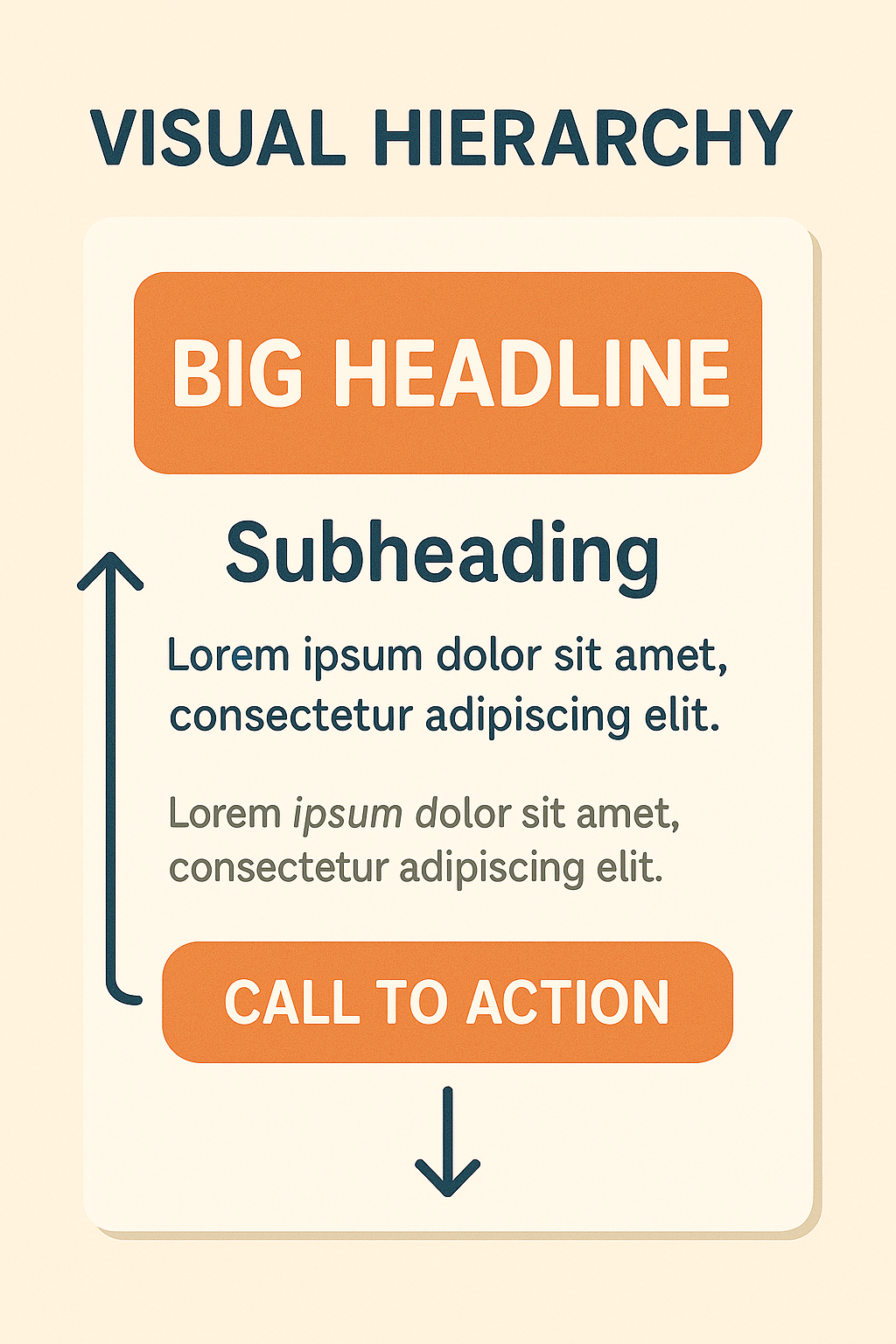
The Importance of Visual Hierarchy
One of the core concepts of UX design is visual hierarchy: the arrangement of elements to signal importance and guide a viewer’s eye.
- In content marketing, this translates into practices like:
- Starting with a bold, clear headline to capture attention
- Using meaningful subheadings to make the content skimmable
- Highlighting key insights using bold text or pull quotes
- Keeping paragraphs short and scannable
This isn’t just design for design’s sake. According to this research from the Nielsen Norman Group, users often read web content in an F-shaped pattern, skimming from top left to right before scanning down the left side. Structuring your content to match this natural reading pattern increases the chances that your message will actually be absorbed (NNG, 2020).
Whitespace Isn’t Wasted Space
Many marketers, especially those trying to cram in as much information as possible, underestimate the value of whitespace. But to UX designers, whitespace (or negative space) is essential. It allows elements on a page to breathe, reduces cognitive overload, and makes the layout feel more organized and inviting.
Consistency Builds Confidence
Users are creatures of habit. UX designers prioritize consistency across interfaces because it helps users build mental models, reducing the time it takes to navigate and understand new content.
For marketers, consistency means:
- Using the same fonts, colors, and spacing throughout a piece (and across all content)
- Writing in a consistent tone and brand voice
- Structuring similar types of content the same way (e.g., all blog posts use the same layout)
Inconsistent layouts and styling can feel jarring or amateurish, subconsciously eroding trust. As usability expert Jakob Nielsen puts it: “Users should not have to wonder whether different words, situations, or actions mean the same thing” (Nielsen's 10 Usability Heuristics).
Designing with Mobile in Mind
With over 55% of global web traffic now coming from mobile devices (Statista, 2024), content that isn’t optimized for small screens will fail.
Mobile-first UX design principles (prioritizing simplicity, fast load times, and thumb-friendly navigation) should also guide your content layout. This means:
- Keeping important information at the top
- Using single-column layouts for easier reading
- Avoiding tiny fonts or crowded layouts
- Ensuring CTAs are easy to tap
Google’s Core Web Vitals also factor mobile usability into their ranking algorithm, meaning that good UX not only improves engagement, it also improves your SEO.

Your CTA Needs to Guide, Not Confuse
A UX designer wouldn’t build a screen without a clear next step, and marketers shouldn’t publish content without a strong, visible call-to-action (CTA).
Effective CTAs:
- Stand out visually (via color, placement, or whitespace)
- Use action-oriented language (“Download the guide,” “Start your free trial”)
- Follow naturally from the content (a CTA to subscribe after a blog post makes sense; a sudden sales pitch might not)
Why Marketers Should Collaborate with UX Designers
If you work in a team with designers, involve them early. Their understanding of user psychology, attention flow, and visual balance can take your content from “just okay” to “visually addictive.”
If you're solo, try reviewing UX case studies or tools like Figma, Adobe XD, or Webflow’s design guides to learn how to build better content layouts yourself.

Conclusion: Great Content Deserves a Great Layout
UX design and content marketing are more connected than ever. If your content isn’t performing, it might not be the words; it might be how those words are presented. By adopting UX design best practices like visual hierarchy, whitespace, consistency, and mobile optimization, marketers can create content that not only looks better but also works better.
Treat your content like a product: design it with the user in mind.